The 'science of where', or GIS, fortified Kenya's response to Covid-19. Here's how

The science consists of a framework for gathering, analysing and visualising spatial data for better decision-making. For example, it may show the shortest route to a health facility from an accident scene. It could identify the hotspots of an epidemic or inform where best to target anti-smoking or anti-crime campaigns.
Geographic information system is one of the components of geospatial technologies, along with satellite navigation systems, earth observation and other emerging technologies. They have had a big impact by enabling very accurate positioning and provision of satellite imagery.
They’ve also been used to infer patterns and spatial relationships in countless applications, such as forest fires and urbanisation.
Organisations and individuals in Kenya have taken advantage of geographic information system to gain spatial insights on Covid-19 to inform decision making and responses. They can show where the vulnerable populations and active cases are, where to find care, and where there are resource gaps. They also build a picture of the pandemic over time.
One analysis by Kenyan health economist and financing researcher Edwine Barasa and colleagues revealed significant gaps in the capacity of hospitals to handle a potential surge in the early phases of the pandemic. In the same analysis they showed that only 22% of Kenya’s population lived within two hours of a facility with an intensive care unit.
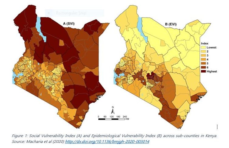
My colleagues and I overlaid a wide range of spatially referenced risk factors for Covid-19 to visualise the risk of infection and the risk of progression to severe disease (see Figure 1) at sub-county level.
These are only a few examples of how geographic information system has been used in Kenya to aid in Covid-19 response. The potential is limited only by our imagination.
Simplifying the data
The health ministry and Kenyatta University GIS laboratory both created online dashboards of reported Covid-19 cases. Their maps simplified the data for easy understanding by the general public. Such dashboards provide a simple and up to date situation report of Covid-19 cases.
The dashboards also show how the pandemic has unfolded across the counties over time. Specific counties, such as Vihiga, applied geographic information system to inform the emergency response by identifying hotspot towns.
Spatial location is also central when collecting self-reported data about Covid-19 risk. Notably, the application developed by WiGISKe provides a list of nearby health facilities where the user can access care in the shortest time possible. The prototype also has the potential to show the distribution of symptoms across the country. This would allow response teams to zoom into presumed hotspots.
Covid-19 has a higher impact on some communities than on others. In sub-Saharan Africa, vulnerability to Covid-19 could be due to underlying health conditions, age, lack of hygiene infrastructure, social mixing patterns and poor health systems. Combining these thematic areas in a composite index identifies the most vulnerable populations.
My colleagues and I created an index like this to signal where to direct support in Kenya. The ministry of health and Fraym have also created risk and vulnerability indices respectively at high spatial resolution.
These indices are relevant to the county, national government and stakeholders for prioritisation and improved planning.
Resource mapping
Geographical access to a facility with an intensive care unit is a key factor in managing severe cases. Mapping by Barasa and colleagues showed that only one in five lived within two hours of such a facility early in the pandemic.
A geospatial analysis by population health researcher Pascal Gedldsetzer and others estimated travel time to all hospitals and the closest healthcare facility of any type for adults aged 60 years and older. This group is identified as high risk across sub-Saharan Africa. These maps can guide decisions about where to set up makeshift hospitals. They can also identify populations that are least likely to seek or access care.
Africa Uncensored and Upande Limited have visualised information on the availability of intensive care beds and ventilators across Kenya. Another research team developed an application displaying the distribution of private and public health facilities across sub-Saharan Africa. This makes it easier to see where there are deficiencies in Covid-19 and routine care.
Covid-19 risk varies by age and sex, which makes it necessary to have population data at a high spatial resolution. The WorldPop demographics portal presents subnational age-sex population distribution maps.
Finally, sharing the best practices in dealing with Covid-19 in localised contexts is important for benchmarking and tailoring of interventions. One such application is an interactive project map that has been compiling the best practices in slums across the world.
There are a lot of opportunities in applying geospatial information system to aid Covid-19 response and other outbreaks. It’s therefore vital that geospatial information system is integrated in the preparedness, surveillance and response of diseases to provide novel spatial sights for targeted responses.
Finally, there is need to address the perennial lack of complete, up-to-date and easily accessible spatial data. This can ease the huge burden of accessing, gathering and cleaning spatial data whenever a health disaster strikes.
This article is republished from The Conversation under a Creative Commons license. Read the original article.![]()
Source: The Conversation Africa

The Conversation Africa is an independent source of news and views from the academic and research community. Its aim is to promote better understanding of current affairs and complex issues, and allow for a better quality of public discourse and conversation.
Go to: https://theconversation.com/africa


